
a RE-DESIGNED website for a roaming community garden
overview
ABOUT THE PROJECT
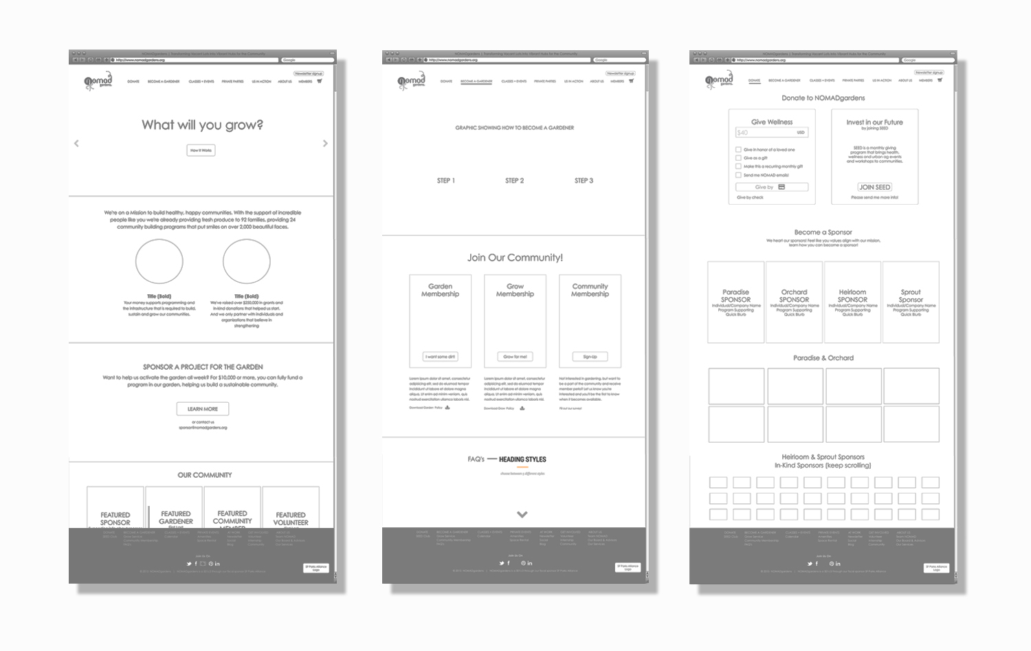
While designing a new responsive website for NOMADgardens (featured here), I was also developing the content strategy for the organization. With a new website in place, the journey from signing up to renewing needed to be intuitive and reflect the new look of the website. User flows provided an outline for the content.
FOCUS: Content Strategy, Marketing Collateral
TIMELINE: 2 weeks
DELIVERABLE: Renewal email, Gardener Policies, Garden Plots Available Flier, Welcome Packet
the problem
A year after its launch, the garden was embarking on its first renewal of gardeners.

HEURISTIC EVALUATION
I conducted a heuristic evaluation to understand currently what the need

DESIGN PROCESS
1. User Research
2. Content Requirements
3. Information Architecture
4. Interaction Design
5. Information Design
USER NEEDS
INTERVIEWS | SURVEYS | GUERRILLA
Constraints: Time - 3 days. Because non-profit founders are busy, I had to be resourceful with my approach. 5 interviews were conducted (4 in person, 1 via Skype), 10 surveys, 2 events (observing) and on-line search of existing non-profit events.
QUESTIONS: How often do you host events? How do you document your events? How big is the population you're serving? How do your users engage pre, during and post events? Do they use social media accounts during your events? Do you curate your own content or share others? Walk me through how you find, secure and report to your donors.
PERSONAS
An affinity map approach (sticky note categorization) was used to synthesize the user research into 3 personas. Coalescing NOMADgardens' business goals and the user needs, Sara was identified as NOMAD's target market and was used to guide future content strategy, to include look, feel and voice.

CONTENT REQUIREMENTS
Sample Flow: Send Test Email
I created a user flow to identify Sara's "happy path" from login to sending an email to a select group of recipients. Beginning with this path helped articulate the simplest actions Sarah would take from start to finish. Task flows were then created from each action item (blue buttons), keeping me focused on simple navigation and a minimum viable product.

MENTAL MODEL
To minimize the Sara's learning curve in using the app, I designed a top tier navigation, second tier navigation and bottom navigation, similar to twitters mobile app. A series of in person card sorts helped categorize and structure the actions. To improve the users experience, the most common actions were placed within the third tier navigation (thumb reach), adjacent to the iPhone's home button.

WIREFRAMING
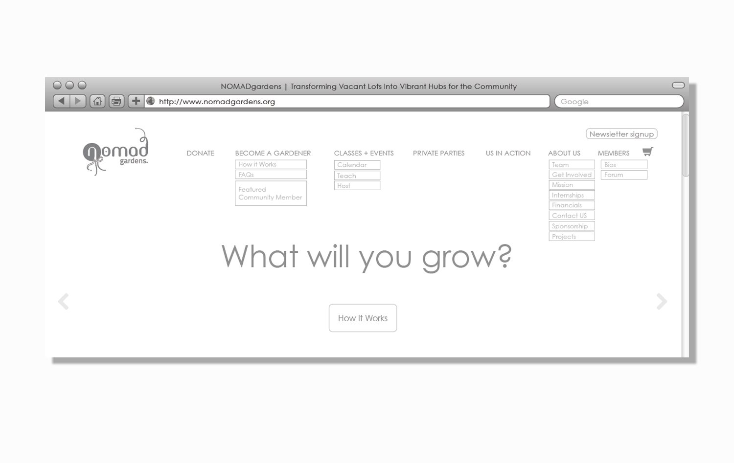
INFORMATION ARCHITECTURE + INTERACTION DESIGN
Using my task flows, I began sketching low-fidelity wireframes, teasing out simple gestures based on user research and testing. For rapid iterations, low-fidelity wireframes were kept to grey scale, keeping stakeholder meetings focused on layout and features, rather than content and color choice. Below is the evolution of one screen from sketch to hi-fidelity wireframe.
NAVIGATION
NAVIGATION + INFORMATION DESIGN
How information would be searched, browsed or selected was designed to meet Sara's busy schedule. User tests showed naming of categories as one of the most critical components to the users confidence in navigating the app. A close second was icon design.
CONTENT STRATEGY
VISUAL DESIGN
NOMADgardens brand needed to evoke growing food, community, learning and having fun! Colors were coded to develop distinctions between specific pillars of their business model and were integrated into the mental map of the app. The teal green was selected as the apps main color to reflect fun and plant growth.
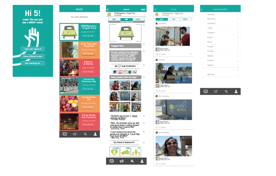
FINAL SCREENS
Below are samples of the final hi-fidelity prototype screens. Delight was introduced at key touch points. For example, a Hi 5 screen was created to launch first when an event she held was completed. Our research showed that founders' work goes mostly unnoticed, so it was important that the app recognized and celebrated her accomplishments.
USER TESTING
RAPID PROTOTYPING
A clickable prototype was created using Flinto and tested on 5 random individuals. Notes were taken and recorded to ensure all feedback was documented. Key features that met Sara's user needs were iterated into the final prototype. The document below outlines the changes I made due to the user test.

deliverable
A NEW RESPONSIVE WEBSITE - CHECK IT OUT HERE!
The final deliverable was a responsive website that provided users an easy way to purchase a subscription to garden, renew subscriptions, review current events, purchase event tickets and see upcoming volunteer days.
NEXT STEPS
More user testing! We are testing our website on our current gadeners to get further feedback on content, membership selection, check out process, forum and renewal process.
